class: center, middle, inverse, title-slide .title[ # Data Visualization in R with ggplot2 📊 ] .subtitle[ ## An Introductory Workshop ] .author[ ### Pete Lawson, Ph.D. ] .institute[ ### <br>JHU Data Services ] .date[ ### March 7<sup>th</sup>, 2023 ] --- layout: true --- class: top ## Workshop guidelines .pull-left[ - **Help** is always available. - Use the Zoom chat (private or public) to ask a question. - Raise your hand 🤚. - And you can always un-mute and ask. ] .pull-right[ <blockquote> Help will always be given at Hogwarts to those who ask for it. .right[-- <cite>Albus Dumbledore</cite>] </blockquote> ] --- class: middle # Data visualization --- ## Data visualization > *"The simple graph has brought more information to the data analyst’s mind than any other device." — John Tukey* - Data visualization is the creation and study of the visual representation of data. - There are many tools for visualizing data (R is one of them), and many approaches/systems within R for making data visualizations (**ggplot2** is one of them, and that's what we're going to use). --- ## ggplot2 `\(\in\)` tidyverse .pull-left[ <img src="img/ggplot2-part-of-tidyverse.png" width="80%" style="display: block; margin: auto;" /> ] .pull-right[ ```r library(tidyverse) ``` - **ggplot2** is tidyverse's data visualization package - The `gg` in "ggplot2" stands for Grammar of Graphics - It is inspired by the book **Grammar of Graphics** by Leland Wilkinson ] --- ## Grammar of Graphics A grammar of graphics is a tool that enables us to concisely describe the components of a graphic. <img src="img/grammar-of-graphics.png" width="60%" style="display: block; margin: auto;" /> .footnote[ Source: [BloggoType](http://bloggotype.blogspot.com/2016/08/holiday-notes2-grammar-of-graphics.html) ] --- ## Hello ggplot2! - `ggplot()` is the main function in ggplot2 - Plots are constructed in layers - Structure of the code for plots can be summarized as ```r ggplot(data = [dataset], mapping = aes(x = [x-variable], y = [y-variable])) + geom_xxx() + other options ``` - For help with the ggplot2 + [ggplot2.tidyverse.org](http://ggplot2.tidyverse.org/) + [ggplot cheat sheet](https://github.com/rstudio/cheatsheets/blob/master/data-visualization-2.1.pdf) --- .panelset[ .panel[.panel-name[Code] ```r ggplot(data = starwars, mapping = aes(x = height, y = mass)) + geom_point() + labs(title = "Mass vs. height of Starwars characters", x = "Height (cm)", y = "Weight (kg)") ``` ] .panel[.panel-name[Plot] ``` ## Warning: Removed 28 rows containing missing values (geom_point). ``` <img src="data-vis-in-r-ggplot2-slides_files/figure-html/unnamed-chunk-7-1.png" width="60%" /> ]] --- ## Parameters of a full ggplot2 visualization: - `data`: the data frame to be plotted - `geometry`: how the data is to be displayed (e.g., scatterplot, barplot, etc.) - `mapping`: how the properties of the data map to the properties of the geometry (e.g., which columns map to X and Y coordinates) - `stat`: the transformation to apply to the data (e.g., count the number of observations) - `position`: how to adjust the positions of displayed elements (e.g., jittering points in a scatterplot) - `coordinate`: whether to use Cartesian coordinates or polar coordinates - `facet`: how to subset the data to create multiple subplots - `theme`: themes control the display of all non-data elements of the plot --- class: middle # Visualizing Star Wars ```r dplyr::starwars ``` --- ## Dataset terminology - Each row is an **observation** - Each column is a **variable** ``` ## # A tibble: 87 × 14 ## name height mass hair_…¹ skin_…² eye_c…³ birth…⁴ sex gender homew…⁵ species films ## <chr> <int> <dbl> <chr> <chr> <chr> <dbl> <chr> <chr> <chr> <chr> <lis> ## 1 Luke Sk… 172 77 blond fair blue 19 male mascu… Tatooi… Human <chr> ## 2 C-3PO 167 75 <NA> gold yellow 112 none mascu… Tatooi… Droid <chr> ## 3 R2-D2 96 32 <NA> white,… red 33 none mascu… Naboo Droid <chr> ## 4 Darth V… 202 136 none white yellow 41.9 male mascu… Tatooi… Human <chr> ## 5 Leia Or… 150 49 brown light brown 19 fema… femin… Aldera… Human <chr> ## 6 Owen La… 178 120 brown,… light blue 52 male mascu… Tatooi… Human <chr> ## # … with 81 more rows, 2 more variables: vehicles <list>, starships <list>, and ## # abbreviated variable names ¹hair_color, ²skin_color, ³eye_color, ⁴birth_year, ## # ⁵homeworld ``` --- ## Luke Skywalker 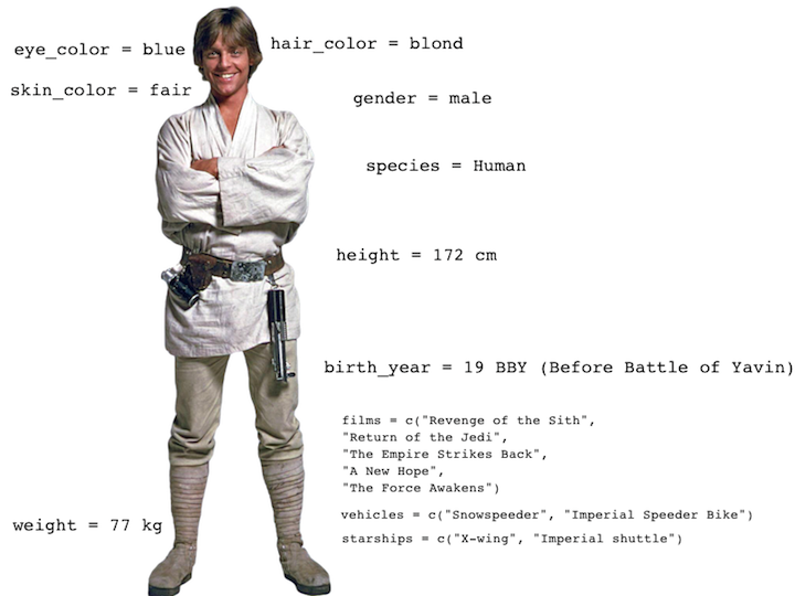 --- ## What's in the Star Wars data? ```r glimpse(starwars) ``` ``` ## Rows: 87 ## Columns: 14 ## $ name <chr> "Luke Skywalker", "C-3PO", "R2-D2", "Darth Vader", "Leia Organa", "Ow… ## $ height <int> 172, 167, 96, 202, 150, 178, 165, 97, 183, 182, 188, 180, 228, 180, 1… ## $ mass <dbl> 77.0, 75.0, 32.0, 136.0, 49.0, 120.0, 75.0, 32.0, 84.0, 77.0, 84.0, N… ## $ hair_color <chr> "blond", NA, NA, "none", "brown", "brown, grey", "brown", NA, "black"… ## $ skin_color <chr> "fair", "gold", "white, blue", "white", "light", "light", "light", "w… ## $ eye_color <chr> "blue", "yellow", "red", "yellow", "brown", "blue", "blue", "red", "b… ## $ birth_year <dbl> 19.0, 112.0, 33.0, 41.9, 19.0, 52.0, 47.0, NA, 24.0, 57.0, 41.9, 64.0… ## $ sex <chr> "male", "none", "none", "male", "female", "male", "female", "none", "… ## $ gender <chr> "masculine", "masculine", "masculine", "masculine", "feminine", "masc… ## $ homeworld <chr> "Tatooine", "Tatooine", "Naboo", "Tatooine", "Alderaan", "Tatooine", … ## $ species <chr> "Human", "Droid", "Droid", "Human", "Human", "Human", "Human", "Droid… ## $ films <list> <"The Empire Strikes Back", "Revenge of the Sith", "Return of the Je… ## $ vehicles <list> <"Snowspeeder", "Imperial Speeder Bike">, <>, <>, <>, "Imperial Spee… ## $ starships <list> <"X-wing", "Imperial shuttle">, <>, <>, "TIE Advanced x1", <>, <>, <… ``` --- ## Another look at Star Wars data .pull-left[ The **skimr** package provides summary statistics the user can skim quickly to understand their data. ```r library(skimr) skim(starwars) ``` ] .pull-right[ <img src="img/skimr.png" width="50%" style="display: block; margin: auto;" /> ] --- .xsmall[ ``` ## ── Data Summary ──────────────────────── ## Values ## Name starwars ## Number of rows 87 ## Number of columns 14 ## _______________________ ## Column type frequency: ## character 8 ## list 3 ## numeric 3 ## ________________________ ## Group variables None ## ## ── Variable type: character ──────────────────────────────────────────────────────────────────────────────────────────── ## skim_variable n_missing complete_rate min max empty n_unique whitespace ## 1 name 0 1 3 21 0 87 0 ## 2 hair_color 5 0.943 4 13 0 12 0 ## 3 skin_color 0 1 3 19 0 31 0 ## 4 eye_color 0 1 3 13 0 15 0 ## 5 sex 4 0.954 4 14 0 4 0 ## 6 gender 4 0.954 8 9 0 2 0 ## 7 homeworld 10 0.885 4 14 0 48 0 ## 8 species 4 0.954 3 14 0 37 0 ## ## ── Variable type: list ───────────────────────────────────────────────────────────────────────────────────────────────── ## skim_variable n_missing complete_rate n_unique min_length max_length ## 1 films 0 1 24 1 7 ## 2 vehicles 0 1 11 0 2 ## 3 starships 0 1 17 0 5 ## ## ── Variable type: numeric ────────────────────────────────────────────────────────────────────────────────────────────── ## skim_variable n_missing complete_rate mean sd p0 p25 p50 p75 p100 hist ## 1 height 6 0.931 174. 34.8 66 167 180 191 264 ▁▁▇▅▁ ## 2 mass 28 0.678 97.3 169. 15 55.6 79 84.5 1358 ▇▁▁▁▁ ## 3 birth_year 44 0.494 87.6 155. 8 35 52 72 896 ▇▁▁▁▁ ``` ] --- ## What's in the Star Wars data? .pull-left[ .discussion[ How many rows and columns does this dataset have? What does each row represent? What does each column represent? ] ```r ?starwars ``` ] .pull-right[ <img src="img/starwars-help-annotated.png" width="100%" /> ] --- .your-turn[ - Answer the questions for `Your Turn 1 - Explore the data` - How many **variables** are present in the `starwars` data? - How many **observations** are present in the `starwars` data? - How many **numeric** variables are present? What are they? ] <div class="countdown" id="timer_6064e829" data-update-every="1" tabindex="0" style="right:0;bottom:0;"> <div class="countdown-controls"><button class="countdown-bump-down">−</button><button class="countdown-bump-up">+</button></div> <code class="countdown-time"><span class="countdown-digits minutes">02</span><span class="countdown-digits colon">:</span><span class="countdown-digits seconds">00</span></code> </div> --- class: middle # Building a Plot Layer by Layer --- - Start with the `starwars` dataframe .pull-left[ ```r *ggplot(data = starwars) ``` ] .pull-right[ <img src="data-vis-in-r-ggplot2-slides_files/figure-html/unnamed-chunk-18-1.png" width="100%" /> ] --- - Start with the `starwars` dataframe, map `height` to the x-axis .pull-left[ ```r ggplot(data = starwars, * mapping = aes(x = height)) ``` ] .pull-right[ <img src="data-vis-in-r-ggplot2-slides_files/figure-html/unnamed-chunk-20-1.png" width="100%" /> ] --- - Start with the `starwars` dataframe, map `height` to the x axis and `mass` to the y-axis .pull-left[ ```r ggplot(data = starwars, mapping = aes(x = height, * y = mass)) ``` ] .pull-right[ <img src="data-vis-in-r-ggplot2-slides_files/figure-html/unnamed-chunk-22-1.png" width="100%" /> ] --- - Start with the `starwars` dataframe, map `height` to the x axis and `mass` to the y-axis. Represent each observation with a point. .pull-left[ ```r ggplot(data = starwars, mapping = aes(x = height, y = mass)) + * geom_point() ``` ] .pull-right[ <img src="data-vis-in-r-ggplot2-slides_files/figure-html/unnamed-chunk-24-1.png" width="100%" /> ] --- - Start with the `starwars` dataframe, map `height` to the x axis and `mass` to the y-axis. Represent each observation with a point and map `gender` to the color of each point .pull-left[ ```r ggplot(data = starwars, mapping = aes(x = height, y = mass, * color = gender)) + geom_point() ``` ] .pull-right[ <img src="data-vis-in-r-ggplot2-slides_files/figure-html/unnamed-chunk-26-1.png" width="100%" /> ] --- - Start with the `starwars` dataframe, map `height` to the x axis and `mass` to the y-axis. Represent each observation with a point and map `gender` to the color of each point and scale each point by the `birth_year` of the observation. .pull-left[ ```r ggplot(data = starwars, mapping = aes(x = height, y = mass, color = gender, * size = birth_year)) + geom_point() ``` ] .pull-right[ <img src="data-vis-in-r-ggplot2-slides_files/figure-html/unnamed-chunk-28-1.png" width="100%" /> ] --- - Start with the `starwars` dataframe, map `height` to the x axis and `mass` to the y-axis. Represent each observation with a point and map `gender` to the color of each point and scale each point by the `birth_year` of the observation. Title the plot "Mass vs. height of Starwars characters". .pull-left[ ```r ggplot(data = starwars, mapping = aes(x = height, y = mass, color = gender, size = birth_year)) + geom_point() + * labs(title = "Mass vs. height of Starwars characters") ``` ] .pull-right[ <img src="data-vis-in-r-ggplot2-slides_files/figure-html/unnamed-chunk-30-1.png" width="100%" /> ] --- - Start with the `starwars` dataframe, map `height` to the x axis and `mass` to the y-axis. Represent each observation with a point and map `gender` to the color of each point and scale each point by the `birth_year` of the observation. Title the plot "Mass vs. height of Starwars characters" and add the subtitle "by gender and birth year". .pull-left[ ```r ggplot(data = starwars, mapping = aes(x = height, y = mass, color = gender, size = birth_year)) + geom_point() + labs(title = "Mass vs. height of Starwars characters", * subtitle = "by gender and birth year") ``` ] .pull-right[ <img src="data-vis-in-r-ggplot2-slides_files/figure-html/unnamed-chunk-32-1.png" width="100%" /> ] --- - Start with the `starwars` dataframe, map `height` to the x axis and `mass` to the y-axis. Represent each observation with a point and map `gender` to the color of each point and scale each point by the `birth_year` of the observation. Title the plot "Mass vs. height of Starwars characters" and add the subtitle "by gender and birth year". Label the x-axis "Height (cm)" .pull-left[ ```r ggplot(data = starwars, mapping = aes(x = height, y = mass, color = gender, size = birth_year)) + geom_point() + labs(title = "Mass vs. height of Starwars characters", subtitle = "by gender and birth year", * x = "Height (cm)") ``` ] .pull-right[ <img src="data-vis-in-r-ggplot2-slides_files/figure-html/unnamed-chunk-34-1.png" width="100%" /> ] --- - Start with the `starwars` dataframe, map `height` to the x axis and `mass` to the y-axis. Represent each observation with a point and map `gender` to the color of each point and scale each point by the `birth_year` of the observation. Title the plot "Mass vs. height of Starwars characters" and add the subtitle "by gender and birth year". Label the x-axis "Height (cm)" and the y-axis "Weight (kg)". .pull-left[ ```r ggplot(data = starwars, mapping = aes(x = height, y = mass, color = gender, size = birth_year)) + geom_point() + labs(title = "Mass vs. height of Starwars characters", subtitle = "by gender and birth year", x = "Height (cm)", * y = "Weight (kg)") ``` ] .pull-right[ <img src="data-vis-in-r-ggplot2-slides_files/figure-html/unnamed-chunk-36-1.png" width="100%" /> ] --- - Start with the `starwars` dataframe, map `height` to the x axis and `mass` to the y-axis. Represent each observation with a point and map `gender` to the color of each point and scale each point by the `birth_year` of the observation. Title the plot "Mass vs. height of Starwars characters" and add the subtitle "by gender and birth year". Label the x-axis "Height (cm)" and the y-axis "Weight (kg)". Label the color legend "Gender" .pull-left[ ```r ggplot(data = starwars, mapping = aes(x = height, y = mass, color = gender, size = birth_year)) + geom_point() + labs(title = "Mass vs. height of Starwars characters", subtitle = "by gender and birth year", x = "Height (cm)", y = "Weight (kg)", * color = "Gender") ``` ] .pull-right[ <img src="data-vis-in-r-ggplot2-slides_files/figure-html/unnamed-chunk-38-1.png" width="100%" /> ] --- - Start with the `starwars` dataframe, map `height` to the x axis and `mass` to the y-axis. Represent each observation with a point and map `gender` to the color of each point and scale each point by the `birth_year` of the observation. Title the plot "Mass vs. height of Starwars characters" and add the subtitle "by gender and birth year". Label the x-axis "Height (cm)" and the y-axis "Weight (kg)". Label the color legend "Gender" and the size legend "Birth year". .pull-left[ ```r ggplot(data = starwars, mapping = aes(x = height, y = mass, color = gender, size = birth_year)) + geom_point() + labs(title = "Mass vs. height of Starwars characters", subtitle = "by gender and birth year", x = "Height (cm)", y = "Weight (kg)", color = "Gender", * size = "Birth year") ``` ] .pull-right[ <img src="data-vis-in-r-ggplot2-slides_files/figure-html/unnamed-chunk-40-1.png" width="100%" /> ] --- class: middle # Mapping --- ## Mapping - A **mapping** describes how to connect features of a data frame to properties of a geometry, and is described by an aesthetic. ```r ggplot(data = starwars, * mapping = aes(x = height, y = mass)) + geom_point() ``` <img src="data-vis-in-r-ggplot2-slides_files/figure-html/unnamed-chunk-41-1.png" width="60%" /> --- ## Labels .small[ ```r ggplot(data = starwars, mapping = aes(x = height, y = mass)) + geom_point() + * labs(title = "Mass vs. height of Starwars characters", * x = "Height (cm)", * y = "Weight (kg)") ``` <img src="data-vis-in-r-ggplot2-slides_files/figure-html/unnamed-chunk-42-1.png" width="70%" /> ] --- ## Mass vs. height .discussion[ How would you describe this relationship? What other variables would help us understand data points that don't follow the overall trend? Who is the not so tall but really heavy character? ] <img src="data-vis-in-r-ggplot2-slides_files/figure-html/unnamed-chunk-43-1.png" width="60%" /> --- ## Jabba! <img src="img/jabbaplot.png" width="768" /> --- .your-turn[ - Create a scatter plot displaying height vs. birth_year. - Can you guess who the outliers are? ] <div class="countdown" id="timer_494f3666" data-update-every="1" tabindex="0" style="right:0;bottom:0;"> <div class="countdown-controls"><button class="countdown-bump-down">−</button><button class="countdown-bump-up">+</button></div> <code class="countdown-time"><span class="countdown-digits minutes">03</span><span class="countdown-digits colon">:</span><span class="countdown-digits seconds">00</span></code> </div> --- ## Yoda! <img src="img/yodaplot.png" width="768" /> --- ## Additional variables We can map additional variables to various features of the plot: - aesthetics - shape - colour - fill - size - alpha (transparency) - faceting: small multiples displaying different subsets --- class: middle # Aesthetics --- ## Aesthetics An aesthetic is a visual property of the objects in your plot. Aesthetics include things like the size, the shape, or the color of your points. <img src="data-vis-in-r-ggplot2-slides_files/figure-html/unnamed-chunk-47-1.png" width="50%" height="30%" /> You can convey information about your data by mapping the aesthetics in your plot to the variables in your dataset. --- For example, you can map the colors of your points to the `gender` variable to reveal the gender of each individual. .small[ ```r ggplot(data = starwars, mapping = aes(x = height, y = mass, * color = gender)) + geom_point() + labs(title = "Mass vs. height of Starwars characters", x = "Height (cm)", y = "Weight (kg)") ``` <img src="data-vis-in-r-ggplot2-slides_files/figure-html/unnamed-chunk-48-1.png" width="60%" /> ] --- ## Aesthetics options Visual characteristics of plotting characters that can be **mapped to a specific variable** in the data are - `color` - `size` - `fill` - `shape` - `alpha` (transparency) --- We can map the size of points to the `birth_year` variable to reveal the birth_year of each individual. .small[ ```r ggplot(data = starwars, mapping = aes(x = height, y = mass, color = gender, * size = birth_year)) + geom_point() + labs(title = "Mass vs. height of Starwars characters", x = "Height (cm)", y = "Weight (kg)") ``` <img src="data-vis-in-r-ggplot2-slides_files/figure-html/unnamed-chunk-49-1.png" width="60%" /> ] --- .small[ ## To map or not to map ... .discussion[Why is the `color` set to blue, but the points are red? ] ```r ggplot(data = starwars, mapping = aes(x = height, y = mass, color = "blue")) + geom_point() + labs(title = "Mass vs. height of Starwars characters", x = "Height (cm)", y = "Weight (kg)") ``` <img src="data-vis-in-r-ggplot2-slides_files/figure-html/unnamed-chunk-50-1.png" width="60%" /> ] --- ## Mass vs. height + gender Let's now increase the size of all points *not* based on the values of a variable in the data, i.e. **set** size instead of **map** size: .midi[ ```r ggplot(data = starwars, mapping = aes(x = height, y = mass, color = gender)) + * geom_point(size = 2) ``` <img src="data-vis-in-r-ggplot2-slides_files/figure-html/unnamed-chunk-51-1.png" width="63%" /> ] --- .your-turn[ For the following code: ```r ggplot(data = starwars, mapping = aes(x = height, y = mass)) + geom_point() ``` - Map the variable `sex` to both point color and shape. What do you notice? - Try mapping a categorical variable to x, for example `eye_color`. What happens? - Try mapping a continuous variable to shape, for example `mass`. What happens? ] <div class="countdown" id="timer_4ab4dc5c" data-update-every="1" tabindex="0" style="right:0;bottom:0;"> <div class="countdown-controls"><button class="countdown-bump-down">−</button><button class="countdown-bump-up">+</button></div> <code class="countdown-time"><span class="countdown-digits minutes">03</span><span class="countdown-digits colon">:</span><span class="countdown-digits seconds">00</span></code> </div> --- ## Aesthetics summary - Continuous variable are measured on a continuous scale - Discrete variables are measured (or often counted) on a discrete scale aesthetics | discrete | continuous ------------- | ------------------------ | ------------ color | rainbow of colors | gradient size | discrete steps | linear mapping between radius and value shape | different shape for each | *shouldn't (and doesn't) work* - Use aesthetics for mapping features of a plot to a variable, define the features in the geom for customization **not** mapped to a variable --- class: middle # Themes --- - `theme_gray()`: The default ggplot2 theme - `theme_bw()`: A high-contrast dark on light theme, good for projector use - `theme_minimal()`: A minimal theme with no background annotations - `theme_classic()`: A simple theme with x and y axis lines and no gridlines - `theme_light()`: A theme with light grey lines and axes, designed to direct attention to the data - `theme_dark()`: A dark background theme to make colored lines pop --- ## `theme_grey()` .pull-left[ .small[ ```r ggplot(data = starwars, mapping = aes(x = height, y = mass, color = gender, size = birth_year)) + geom_point(alpha = 0.7) + labs(title = "Mass vs. height of Starwars characters", subtitle = "by gender and birth year", x = "Height (cm)", y = "Weight (kg)", color = "Gender", size = "Birth year") + * theme_grey() ``` ] ] .pull-right[ 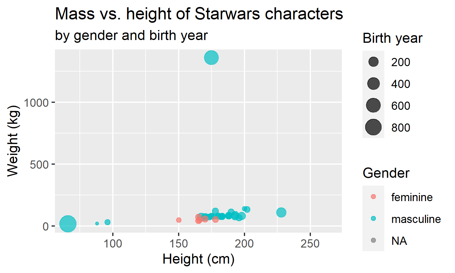<!-- --> ] --- ## `theme_minimal()` .pull-left[ .small[ ```r ggplot(data = starwars, mapping = aes(x = height, y = mass, color = gender, size = birth_year)) + geom_point(alpha = 0.7) + labs(title = "Mass vs. height of Starwars characters", subtitle = "by gender and birth year", x = "Height (cm)", y = "Weight (kg)", color = "Gender", size = "Birth year") + * theme_minimal() ``` ] ] .pull-right[ 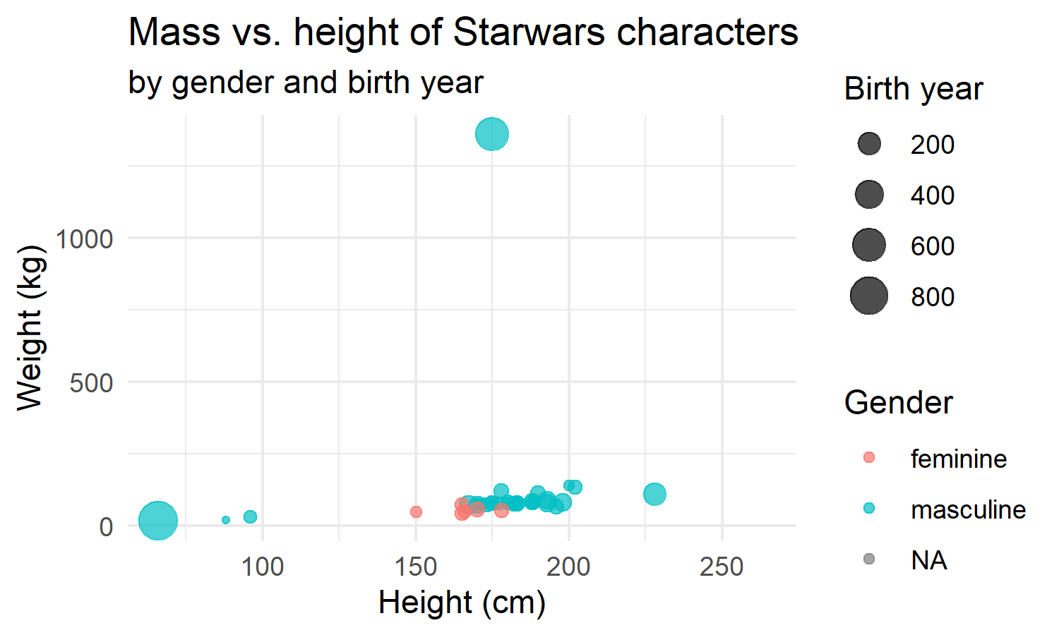<!-- --> ] --- ## `theme_dark()` .pull-left[ .small[ ```r ggplot(data = starwars, mapping = aes(x = height, y = mass, color = gender, size = birth_year)) + geom_point(alpha = 0.7) + labs(title = "Mass vs. height of Starwars characters", subtitle = "by gender and birth year", x = "Height (cm)", y = "Weight (kg)", color = "Gender", size = "Birth year") + * theme_dark() ``` ] ] .pull-right[ 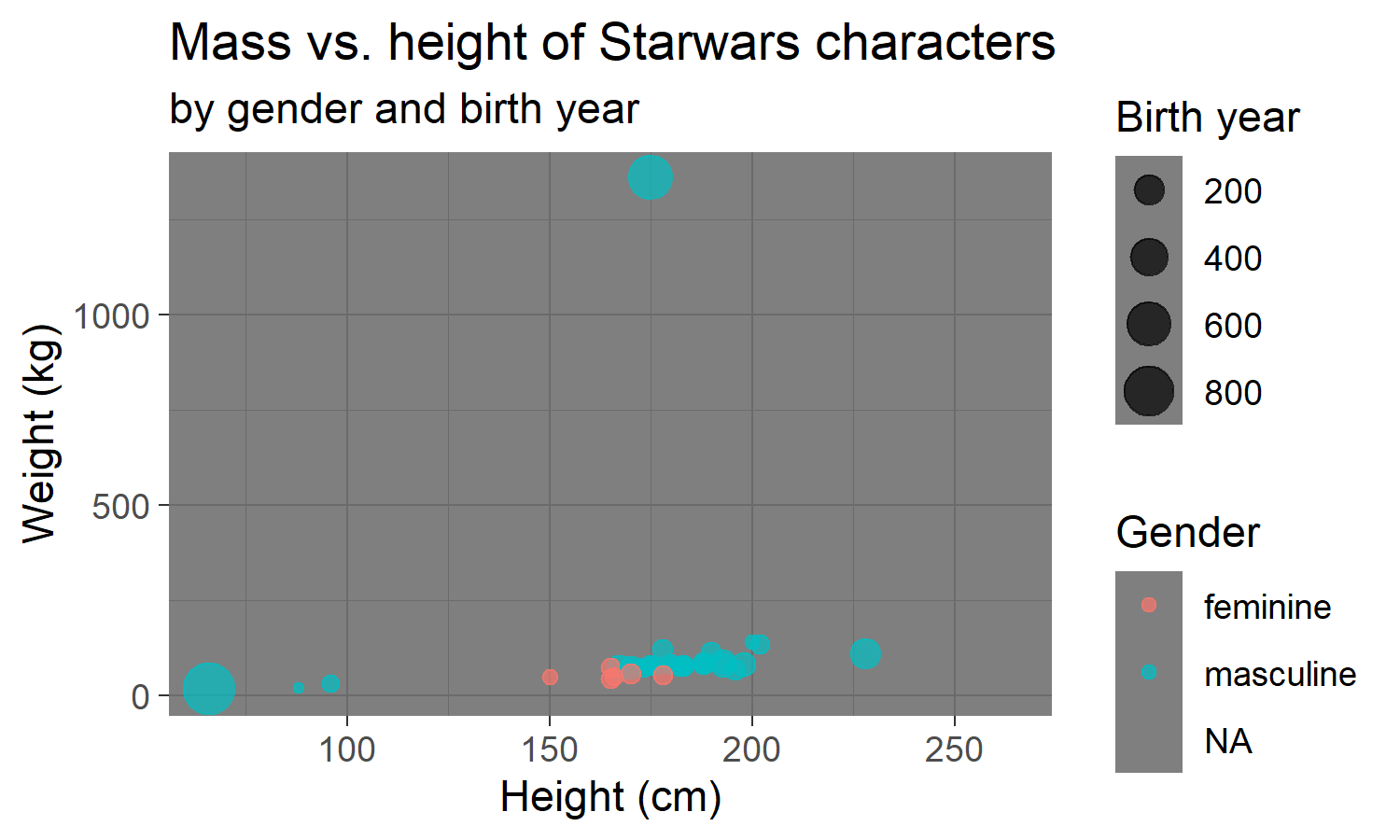<!-- --> ] --- ## `theme_classic()` .pull-left[ .small[ ```r ggplot(data = starwars, mapping = aes(x = height, y = mass, color = gender, size = birth_year)) + geom_point(alpha = 0.7) + labs(title = "Mass vs. height of Starwars characters", subtitle = "by gender and birth year", x = "Height (cm)", y = "Weight (kg)", color = "Gender", size = "Birth year") + * theme_classic() ``` ] ] .pull-right[ <!-- --> ] --- ## Customizing a theme .pull-left[ ```r ggplot(data = starwars, mapping = aes(x = height, y = mass, color = gender, size = birth_year)) + geom_point(alpha = 0.7) + labs(title = "Mass vs. height of Starwars characters", subtitle = "by gender and birth year", x = "Height (cm)", y = "Weight (kg)", color = "Gender", size = "Birth year") + theme_classic () + * theme() ``` ] .pull-right[ <!-- --> ] --- Move the **legend** to the bottom .pull-left[ ```r ggplot(data = starwars, mapping = aes(x = height, y = mass, color = gender, size = birth_year)) + geom_point(alpha = 0.7) + labs(title = "Mass vs. height of Starwars characters", subtitle = "by gender and birth year", x = "Height (cm)", y = "Weight (kg)", color = "Gender", size = "Birth year") + theme_classic () + * theme(legend.position = "bottom") ``` ] .pull-right[ <!-- --> ] --- Move the **legend** to the bottom and stack individual legends vertically .pull-left[ ```r ggplot(data = starwars, mapping = aes(x = height, y = mass, color = gender, size = birth_year)) + geom_point(alpha = 0.7) + labs(title = "Mass vs. height of Starwars characters", subtitle = "by gender and birth year", x = "Height (cm)", y = "Weight (kg)", color = "Gender", size = "Birth year") + theme_classic () + theme(legend.position = "bottom", * legend.box = "vertical") ``` ] .pull-right[ <!-- --> ] --- Move the **legend** to the bottom and stack individual legends vertically. Increase the title font to size 20. .pull-left[ ```r ggplot(data = starwars, mapping = aes(x = height, y = mass, color = gender, size = birth_year)) + geom_point(alpha = 0.7) + labs(title = "Mass vs. height of Starwars characters", subtitle = "by gender and birth year", x = "Height (cm)", y = "Weight (kg)", color = "Gender", size = "Birth year") + theme_classic () + theme(legend.position = "bottom", legend.box = "vertical" * plot.title = element_text(size = 20)) ``` ] .pull-right[ <!-- --> ] --- class: middle # Faceting --- ## Faceting - Smaller plots that display different subsets of the data, otherwise known as "small multiples" - Useful for exploring conditional relationships and large data --- ```r ggplot(data = starwars, mapping = aes(x = height, y = mass)) + * facet_grid(. ~ gender) + geom_point() + labs(title = "Mass vs. height of Starwars characters", * subtitle = "Faceted by gender") ``` 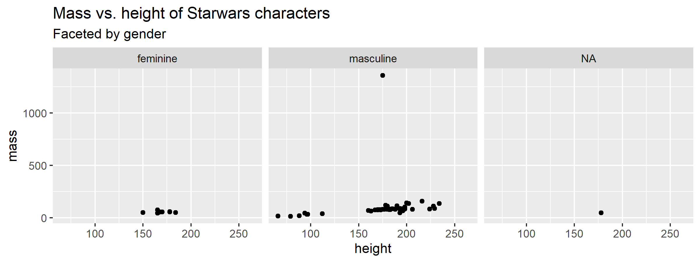<!-- --> --- .discussion[ Look through the next three slides titled Facet 1, 2, and 3 describe what each plot displays. Think about how the code relates to the output. **Note:** The plots in the next few slides do not have proper titles, axis labels, etc. because we want you to figure out what's happening in the plots. But you should always label your plots! ] --- ### Facet 1 ```r ggplot(data = starwars, mapping = aes(x = height, y = mass)) + geom_point() + facet_grid(gender ~ .) ``` <!-- --> --- ### Facet 2 ```r ggplot(data = starwars, mapping = aes(x = height, y = mass)) + geom_point() + facet_grid(. ~ gender) ``` <!-- --> --- ### Facet 3 ```r ggplot(data = starwars, mapping = aes(x = height, y = mass)) + geom_point() + facet_grid(sex ~ gender) ``` <!-- --> --- ### Facet 4 ```r ggplot(data = starwars, mapping = aes(x = height, y = mass)) + geom_point() + facet_wrap(~ eye_color) ``` <!-- --> --- ## Facet summary - `facet_grid()`: - 2d grid - `rows ~ cols` - use `.` for no split - `facet_wrap()`: 1d ribbon wrapped into 2d --- class: middle # Geometry --- .discussion[ What does `geom_smooth()` do? ] ```r ggplot(data = starwars, mapping = aes(x = height, y = mass)) + geom_point() + * geom_smooth() + labs(title = "Mass vs. height of Starwars characters", x = "Height (cm)", y = "Weight (kg)") ``` <img src="data-vis-in-r-ggplot2-slides_files/figure-html/unnamed-chunk-74-1.png" width="50%" /> --- .discussion[ What is the difference between these plots? ] .pull-left[ <!-- --> ] .pull-right[ 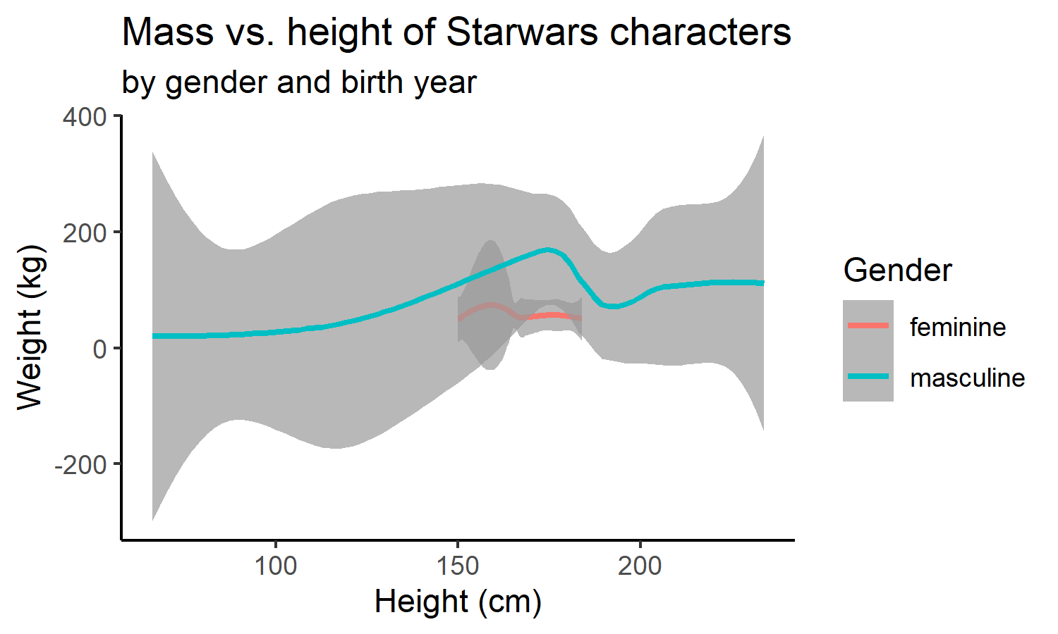<!-- --> ] --- .discussion[ What is the difference between these plots? ] .pull-left[ ```r ggplot(data = starwars, mapping = aes(x = height, y = mass, color = gender, size = birth_year)) + geom_point(alpha = 0.7) + labs(title = "Mass vs. height of Starwars characters", subtitle = "by gender and birth year", x = "Height (cm)", y = "Weight (kg)", color = "Gender", size = "Birth year") + theme_classic () ``` ] .pull-right[ ```r ggplot(data = starwars, mapping = aes(x = height, y = mass, color = gender, size = birth_year)) + geom_smooth(alpha = 0.7) + labs(title = "Mass vs. height of Starwars characters", subtitle = "by gender and birth year", x = "Height (cm)", y = "Weight (kg)", color = "Gender", size = "Birth year") + theme_classic () ``` ] --- class: middle # Identifying variables --- ## Types of variables - **Numerical variables** can be classified as **continuous** or **discrete** based on whether or not the variable can take on an infinite number of values or only non-negative whole numbers, respectively. - If the variable is **categorical**, we can determine if it is **ordinal** based on whether or not the levels have a natural ordering. R uses the term **factor** for most categorical data. --- class: middle # Visualizing numerical data --- ## Histograms ```r ggplot(data = starwars, mapping = aes(x = height)) + geom_histogram(binwidth = 10) ``` <img src="data-vis-in-r-ggplot2-slides_files/figure-html/unnamed-chunk-79-1.png" width="75%" /> --- ## Density plots ```r ggplot(data = starwars, mapping = aes(x = height)) + geom_density() ``` <img src="data-vis-in-r-ggplot2-slides_files/figure-html/unnamed-chunk-80-1.png" width="75%" /> --- ## Box plots ```r ggplot(data = starwars, mapping = aes(y = height)) + geom_boxplot() ``` <img src="data-vis-in-r-ggplot2-slides_files/figure-html/unnamed-chunk-81-1.png" width="60%" /> --- class: middle # Visualizing relationships between numerical and categorical data --- ## Side-by-side box plots ```r ggplot(data = starwars, mapping = aes(y = height, x = gender)) + geom_boxplot() ``` <img src="data-vis-in-r-ggplot2-slides_files/figure-html/unnamed-chunk-82-1.png" width="75%" /> --- ## Scatter plot... This is not a great representation of these data. ```r ggplot(data = starwars, mapping = aes(y = height, x = gender)) + geom_point() ``` <img src="data-vis-in-r-ggplot2-slides_files/figure-html/unnamed-chunk-83-1.png" width="60%" /> --- ## Violin plots ```r ggplot(data = starwars, mapping = aes(y = height, x = gender)) + geom_violin() ``` <img src="data-vis-in-r-ggplot2-slides_files/figure-html/unnamed-chunk-84-1.png" width="75%" /> --- ## Jitter plot ```r ggplot(data = starwars, mapping = aes(y = height, x = gender)) + geom_jitter() ``` <img src="data-vis-in-r-ggplot2-slides_files/figure-html/unnamed-chunk-86-1.png" width="75%" /> --- ## Beeswarm plots ```r library(ggbeeswarm) ggplot(data = starwars, mapping = aes(y = height, x = gender)) + geom_beeswarm() ``` <img src="data-vis-in-r-ggplot2-slides_files/figure-html/unnamed-chunk-87-1.png" width="70%" /> --- class: middle # Visualizing categorical data --- ## Bar plots ```r ggplot(data = starwars, mapping = aes(x = gender)) + geom_bar() ``` <img src="data-vis-in-r-ggplot2-slides_files/figure-html/unnamed-chunk-88-1.png" width="70%" /> --- ## Segmented bar plots, counts .midi[ ```r ggplot(data = starwars, mapping = aes(x = gender, fill = hair_color)) + geom_bar() ``` 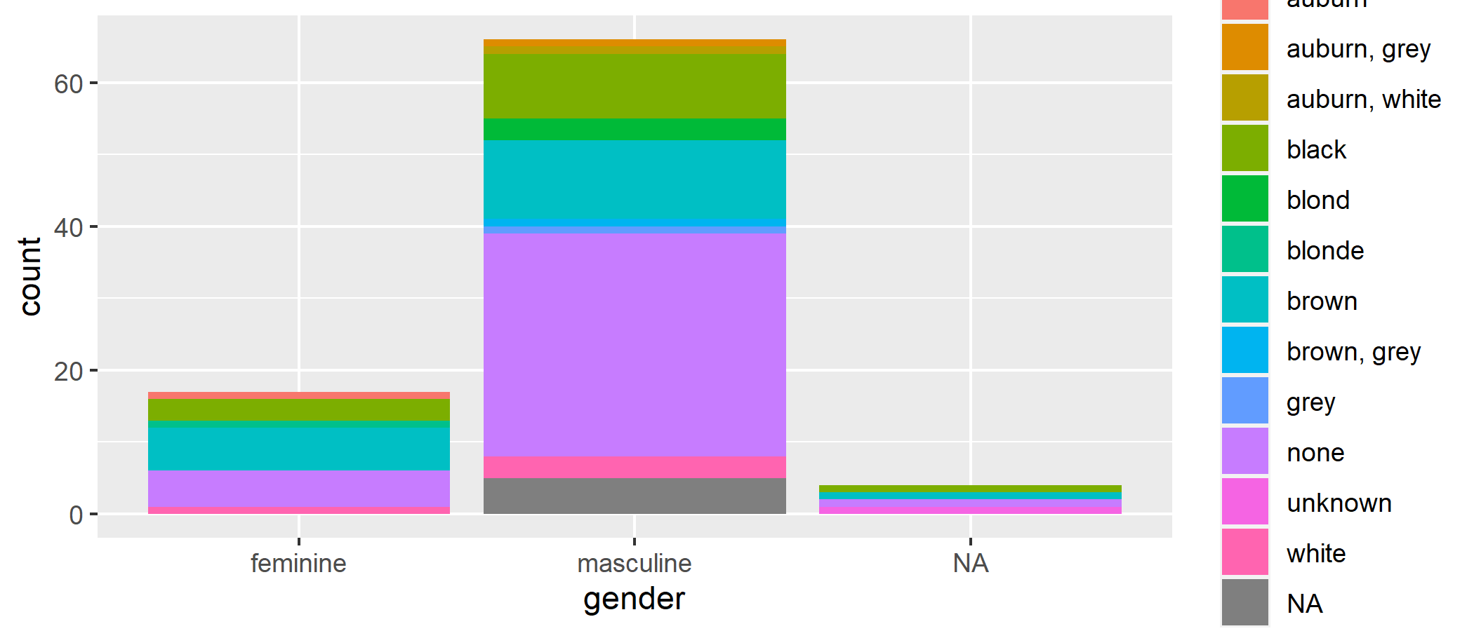<!-- --> ] --- ## Recode hair color Using the `fct_other()` function from the **forcats** package, which is also part of the **tidyverse**. ```r starwars <- starwars %>% mutate( hair_color2 = fct_lump_min(hair_color, min = 10) ) ``` --- ## Segmented bar plots, counts ```r ggplot(data = starwars, mapping = aes(y = gender, fill = hair_color2)) + geom_bar() ``` <img src="data-vis-in-r-ggplot2-slides_files/figure-html/unnamed-chunk-91-1.png" width="65%" /> --- Set `position='dodge'` to enable side-by-side barplots. ```r ggplot(data = starwars, mapping = aes(y = gender, fill = hair_color2)) + geom_bar(position = 'dodge') ``` <img src="data-vis-in-r-ggplot2-slides_files/figure-html/unnamed-chunk-92-1.png" width="65%" /> --- ## Segmented bar plots, proportions ```r ggplot(data = starwars, mapping = aes(y = gender, fill = hair_color2)) + geom_bar(position = "fill") + labs(x = "proportion") ``` <img src="data-vis-in-r-ggplot2-slides_files/figure-html/unnamed-chunk-93-1.png" width="65%" /> --- .discussion[ Which bar plot is a more useful representation for visualizing the relationship between gender and hair color? ] .pull-left[ <img src="data-vis-in-r-ggplot2-slides_files/figure-html/unnamed-chunk-94-1.png" width="95%" /> ] .pull-right[ <img src="data-vis-in-r-ggplot2-slides_files/figure-html/unnamed-chunk-95-1.png" width="95%" /> ] --- class: middle # Questions? ### Some Useful Resources: - [R for Data Science](https://r4ds.had.co.nz/) - [ggplot2: Elegant Graphics for Data Visualization](https://ggplot2-book.org/index.html) .footnote[ Please complete the survey for this workshop:<br> [bit.ly/ggplot2-survey](https://bit.ly/ggplot2-survey) ] ---